See How a Single Product Performs Across Every Store
To see how one product is doing across your stores, open the Product Analysis tab in Analytics and pick the product. You get how each variant (SKU) sold in every connected store, three trend charts split by store, and a profit summary. You can spot which store or variant is dragging the product down without exporting anything. Use it when a product in the Product Performance table needs a closer look.
Applies to: Lite and up. On Free you'll see an upgrade option instead of this tab.

How do I open Product Analysis for a product?
Click the Product Analysis tab, then click the Product selector at the top and search by name or SKU. If you arrived here by clicking a row in the Product Performance table, the product is already selected for you.
What does the Sales row show?
Five cards, covering every order for this product in your current date range and filters, across every channel including TikTok:
- Product GMV: what the product sold for, before fees or costs.
- Orders and Units Sold: counts for the period.
- Avg Price: average selling price per unit.
- Avg Units / Order: how many units a typical order for this product contains.
What does the Payout & Fees row show?
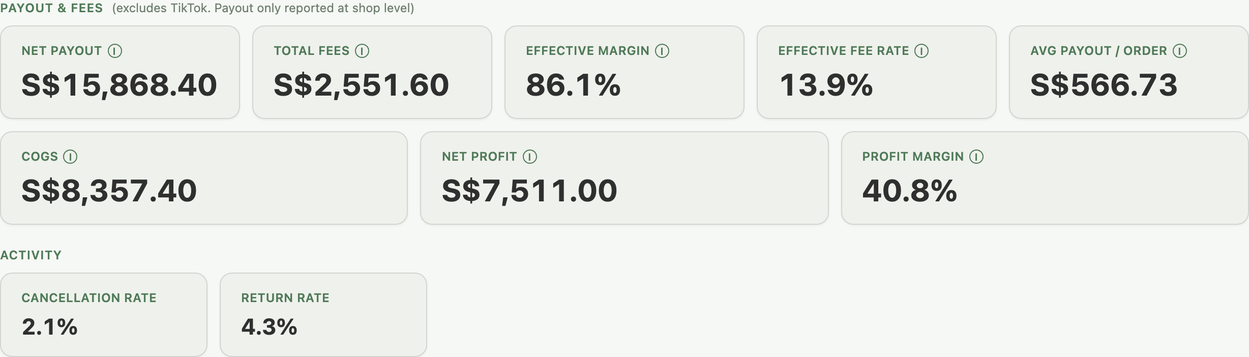
This row is built from money already paid out, and TikTok is excluded because it reports payout only at shop level. It appears once the product has at least one settled order outside TikTok.
- Net Payout, Total Fees, Effective Margin, Effective Fee Rate, Avg Payout / Order: the same profit-and-fee metrics you'd see in Financials, scoped to just this product.
- COGS: the cost of goods sold, across every order in the period, not only settled ones.
- Net Profit: Net Payout minus COGS.
- Profit Margin: Net Profit as a share of payout-eligible revenue.
COGS, Net Profit and Profit Margin show a dash when any sale behind them has no recorded cost price, and never fall back to a profit "Before cost of goods" as Financials does. Without TikTok sales, a note under the Net Profit card says some sales have no recorded cost. Net Profit also shows a dash when a store's payout can't be converted to your main currency. See Set Your Cost Prices.
Example: your product sells on Shopee, Lazada and TikTok Shop. The Payout & Fees row shows Net Profit with a trailing asterisk. That figure only covers the Shopee and Lazada sales; TikTok pays out for the whole shop rather than per product, so there's no per-product payout to add in.
If a product sells on TikTok only, the whole Payout & Fees row is hidden. Its Sales row still counts TikTok normally.
What does the Activity row show?
Two cards: Cancellation Rate and Return Rate, for the same orders as the Sales row above.
How do the trend charts work?
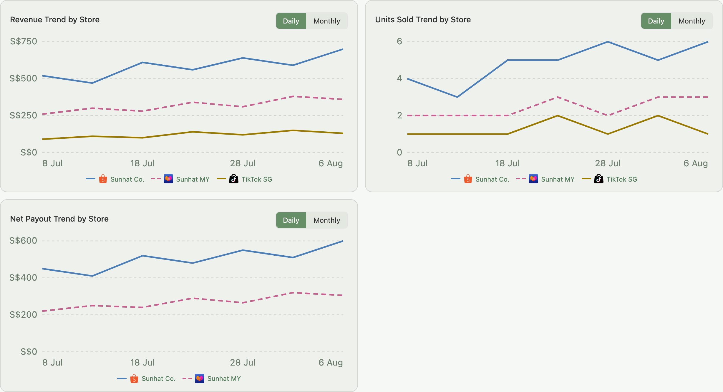
Three charts sit below the KPI cards: Revenue Trend by Store, Units Sold Trend by Store, and Net Payout Trend by Store. Each has its own Daily/Monthly toggle and draws one line per store that sold the product.
- No total line. Read each store's line on its own.
- Monthly view. The first and last months cover only the days inside your date range, so their bars can look short.
- Colours. Each store has its own colour and line style, the same on every page and in the cards below.
- More than six stores: each chart draws your top 5 plus one grey Other stores line, with Show all to draw every store.
- Currency. Revenue and Net Payout lines are converted to your main currency, with a note under the chart; a store with no rate is named after Not shown:. See Your Financials Page for how conversion works.
- TikTok never has a Net Payout line, since it has no per-order payout.
- Scope to one SKU by clicking its row in the table below, or with the SKU dropdown next to the Product selector. Switching the table's metric does not change the charts.
How do I read the SKU Breakdown table?
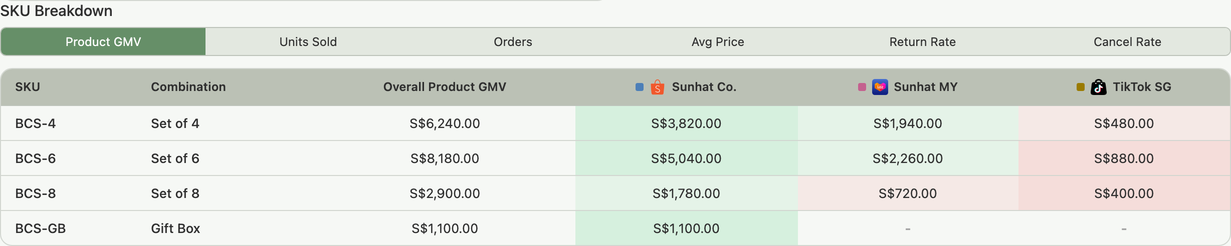
Below the trend charts is a table with one row per SKU of the selected product. Six buttons under the SKU Breakdown heading switch the metric: Product GMV, Units Sold, Orders, Avg Price, Return Rate, Cancel Rate.
- Rows: every SKU of the selected product.
- Columns: each store that sold this product in the period. A store with no sales of it is left out entirely, so the table stays narrow.
- More than six stores: the top 5 for the chosen metric, then one Other stores column and Show all. Other stores adds up Product GMV, Units Sold and Orders, and shows a dash for averages and rates, which can't be added.
- Cells: colour-graded green (high) to red (low) within each row only, so colours in different rows aren't compared.
Click a row to scope all three trend charts above to just that SKU. Click it again, or click a different row, to switch focus.
Example: your Bamboo Cutlery Set sells as four SKUs: Set of 4, Set of 6, Set of 8, and a Gift Box. The Revenue Trend by Store chart shows one store dipping for a few days. You click the Set of 6 row in the table below. All three trend charts scope to that one SKU and the dip is still there, so Set of 6 is the variant worth checking for a stock or listing issue.
What does the Store Performance section show?
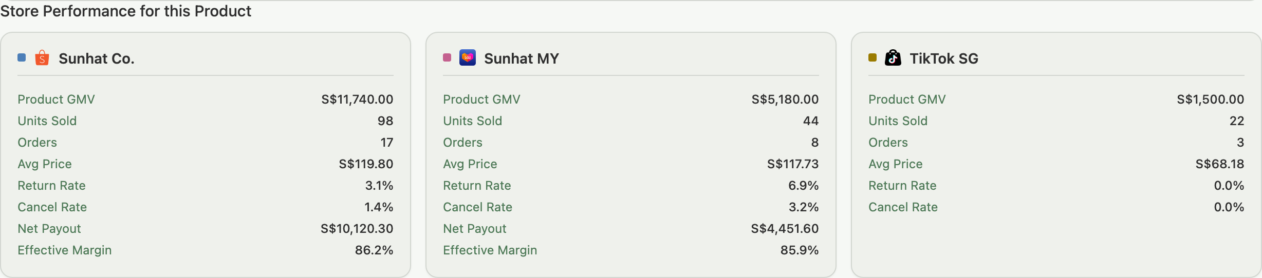
Below the table you get one card per store that sold the product, listing Product GMV, Units Sold, Orders, Avg Price, Return Rate and Cancel Rate. Every store except TikTok also gets Net Payout and Effective Margin, which TikTok can't have for the same shop-level payout reason. With more than six stores, you see the top 5 by Product GMV, one Other stores row, and Show all.
How do I export this to CSV?
Click Export CSV in the page header to download a SKU-level breakdown for the selected product. It has each SKU's per-store metrics for the current date range, plus the profit columns (Net Payout, Eff Margin, COGS, Net Profit, Profit Margin). Export is included on every plan that can open this tab.
- Per-store columns are headed with the store's full name and the metric, for example "Coffee Corner Product GMV", and stay in each store's own currency.
- Same-named stores add the marketplace in brackets, such as "Asian Beauty X (Lazada)", or a store number on the same marketplace and country, such as "(Lazada, store 1)".
Why might a cell show a dash?
- In the SKU Breakdown table: a plain "-" means that SKU had no sales in that store during the period. A long dash means the amount couldn't be converted to your main currency.
- In the Payout & Fees cards for COGS, Net Profit, or Profit Margin: some or all of the sales behind that figure have no recorded cost price yet. See Set Your Cost Prices.
- In Store Performance, on Net Payout or Effective Margin: the product had no settled orders in that store for the period. Cost price doesn't affect these two figures.
Troubleshooting
All cells in a row are the same colour. The metric is uniform across stores for that SKU. Nothing to investigate.
The table looks sparse with lots of dashes. Individual SKUs often sell on some stores and not others, or the period is too short. Stores that sold none of the product are left out entirely, so a sparse table means patchy SKU coverage, not a missing store.
The product selector shows no results. The product may have no orders in the current date range, or may not be synced to any connected store yet. Try widening the date range, or check Product Performance Tab to browse all products with recent order activity.
FAQ
Why don't the trend charts change when I click a different SKU Breakdown metric?
They're independent. The three trend charts are always Revenue, Units Sold and Net Payout by store; the SKU Breakdown metric selector only changes the table below them. To scope the charts, click a row in the table instead.
Why is there no Payout & Fees row for some products?
That section only appears once a product has at least one settled, non-TikTok order. A brand-new product, or one that sells on TikTok only, won't have one yet.
Why does a store's column disappear from the SKU Breakdown table?
Stores are only shown if they sold at least one unit of the selected product in the current period. A store with zero sales of that product is left out, not shown with dashes.
Can I see a combined total across all stores on the trend charts?
No. Each of the three charts plots one line per store with no total line. Read the lines individually, or narrow the date range and filters if you want to focus on fewer stores.
Why does TikTok show no Net Payout on the Store Performance cards?
TikTok reports payout for the whole shop rather than per order, so there's no reliable way to attribute a payout figure to one product. Its card shows Sales and Activity metrics only.
Related Articles
- See Which Marketplace Actually Makes You Money
- Understanding Revenue and Seller Payout
- Set Your Cost Prices
- Product Performance Tab
- How to Upgrade Your Plan
Need More Help?
Visit our Feedback page, WhatsApp us, or email hello@indexync.com with your account details and any questions about the Product Analysis tab.